Before I read this article about “What Your Choice Of Font Says About You”, I picked my favorite fonts. (I don’t actually care what anything “says about me”, because the opinions of others are largely irrelevant in my life anyway.)
They are: Times New Roman (or Book Antiqua) for my novels; Verdana for this blog (although WordPress gives one no choice, I’d probably stick with it anyway because it’s highly legible); and for some reason, I like Papyrus for my book titles — although I was talked out of it after the first edition of Family Fortunes by my editor.
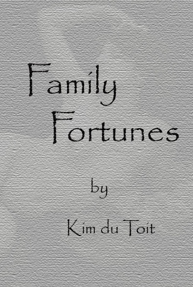
I was kinda disappointed by that, because I’d designed the first version myself, based as it was on Vienna Days (my first published novel):
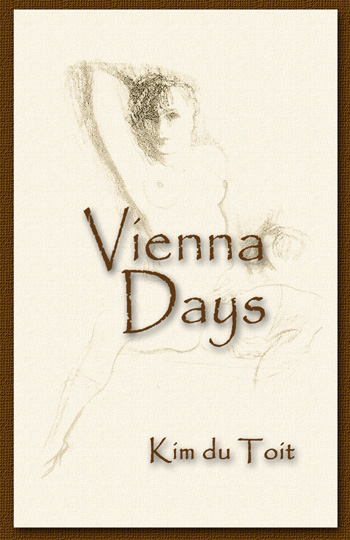
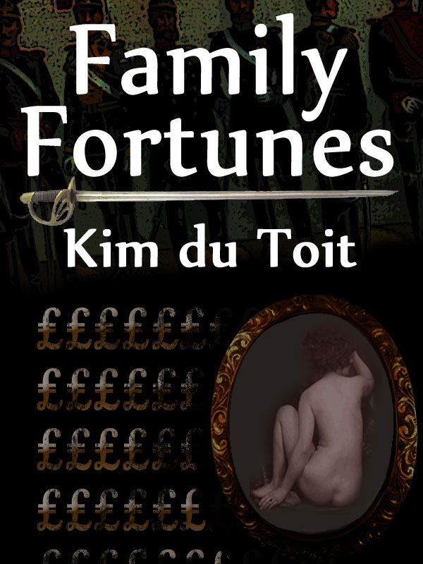
…and which I wanted to continue through all my historical novels to come. But no. “Not punchy enough” and “Too whimsical” — and out went that design.
I still regret the change, though.
I had intended to have a totally different style for any non-historical works, e.g. Prime Target:

…because that format required a different feel, and I was quite okay with that. But no: “All your book covers should have a consistent look”, and as a one-time advertising and marketing executive, I had to agree with that.
It seems that I have digressed completely from the original thrust of this post, sorry. Allow me to continue.
I find it interesting that a typeface / font should define a generation, but I shouldn’t be, really. I mean, if I were to use something like:
![]()
…it might have worked back in the times of Edmund Blackadder (the latter word being the font’s actual name), but most readers of today would react by closing the book firmly, never to be read again.
Then again, there’s the Edwardian font:
![]()
…which might have suited the Victorian tone of Family Fortunes, but the readers’ reaction would probably have been the same.
But I draw the line at Comic Sans MS:
![]()
…which, as its very name suggests, should remain relegated to comic books.
And I don’t do comic books — neither writing nor reading. Anyway:
The results revealed that Times New Roman – a font first designed back in 1931 – remains the most popular font, chosen by 27 per cent of respondents.
1931 is a little recent, for my liking, but as it replaced the handwriting-based Edwardian, it’ll have to do.
Then there’s this little snippet:
The news comes shortly after Microsoft replaced Calibri as its default font for the first time in 17 years.
It should come as no surprise to my Loyal Readers that Calibri is my favorite font for spreadsheets.
[200,000 words of angry anti-Microsoft vitriol deleted]
Then again, as I refuse to use the dreadful MS Excel at all, that change won’t affect me.