
Before I read this article about “What Your Choice Of Font Says About You”, I picked my favorite fonts. (I don’t actually care what anything “says about me”, because the opinions of others are largely irrelevant in my life anyway.)
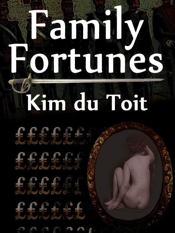
They are: Times New Roman (or Book Antiqua) for my novels; Verdana for this blog (although WordPress gives one no choice, I’d probably stick with it anyway because it’s highly legible); and for some reason, I like Papyrus for my book titles — although I was talked out of it after the first edition of Family Fortunes by my editor.
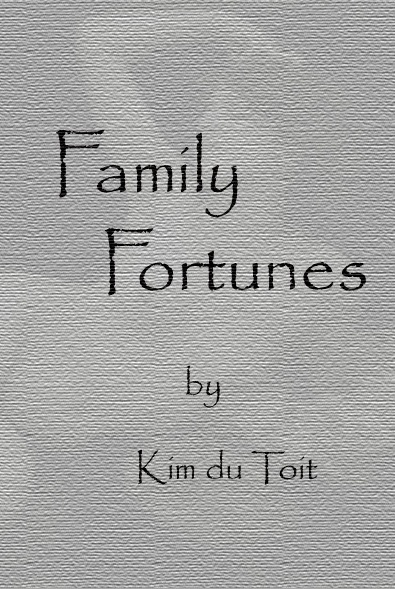
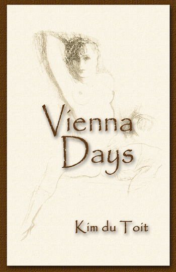
I was kinda disappointed by that, because I’d designed the first version myself, based as it was on Vienna Days (my first published novel):
…and which I wanted to continue through all my historical novels to come. But no. “Not punchy enough” and “Too whimsical” — and out went that design.
I still regret the change, though.
I had intended to have a totally different style for any non-historical works, e.g. Prime Target:
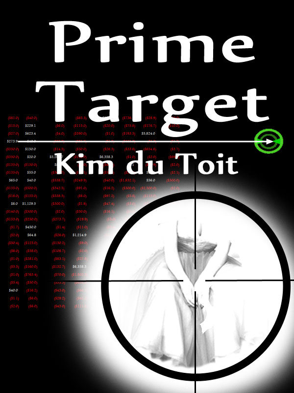
…because that format required a different feel, and I was quite okay with that. But no: “All your book covers should have a consistent look”, and as a one-time advertising and marketing executive, I had to agree with that.
It seems that I have digressed completely from the original thrust of this post, sorry. Allow me to continue.
I find it interesting that a typeface / font should define a generation, but I shouldn’t be, really. I mean, if I were to use something like:
![]()
…it might have worked back in the times of Edmund Blackadder (the latter word being the font’s actual name), but most readers of today would react by closing the book firmly, never to be read again.
Then again, there’s the Edwardian font:
![]()
…which might have suited the Victorian tone of Family Fortunes, but the readers’ reaction would probably have been the same.
But I draw the line at Comic Sans MS:
![]()
…which, as its very name suggests, should remain relegated to comic books.
And I don’t do comic books — neither writing nor reading. Anyway:
The results revealed that Times New Roman – a font first designed back in 1931 – remains the most popular font, chosen by 27 per cent of respondents.
1931 is a little recent, for my liking, but as it replaced the handwriting-based Edwardian, it’ll have to do.
Then there’s this little snippet:
The news comes shortly after Microsoft replaced Calibri as its default font for the first time in 17 years.
It should come as no surprise to my Loyal Readers that Calibri is my favorite font for spreadsheets.
[200,000 words of angry anti-Microsoft vitriol deleted]
Then again, as I refuse to use the dreadful MS Excel at all, that change won’t affect me.

I think I could probably live with Aptos; give me a year and I may or may not revert to calibri; I like the appearance also.
But what I find far more interesting at the link is the new “feminist font”; it’s a real … I’m not quite certain I can find the proper word for it.
Palatino and Garamond for me.
I once had a boss who, after someone had given a long and involved presentation, would respond thusly:
Slide 3 used a different font from slide 1, you indentations on slides 4-6 don’t match the rest of the slides, your font sizes on slides 5, 8 and 9 don’t match and you charting software doesn’t match the PowerPoint layout grid. You should correct that immediately. Also, two typos and a missing punctuation that you should easily find yourself. I’d prefer you switch the entire presentation to Calibri since that is the company standard, which was clearly communicated three years ago in a company wide email.
Not a single comment on the actual contents of the presentation, just nit-pic the font. He obviously had an eye for detail and an autistic-like singular focus.
How did he ever get promoted when he seems to have zero appreciation of the substantive issues?
Tahoma and Lucida Handwriting for me.
Liberation Serif, which is a near clone of Times New Roman, and Liberation Sans Italic for quotations and also in spreadsheets (all maybe, just maybe, all three of them in the last 10 years!).
For the name of my sailboat, which has to be in 4 inch high letters, I used Imprint MT Shadow, a font which really only works in large point sizes.
You can see it here: https://freefontsfamily.com/imprint-shadow-font-free/
As long as it’s legible and not too fancy, I’m not terribly concerned about typefaces.
Regarding the content of your examples, I’m reminded of _The Yellow Room: Alice Darvell’s Subjection, A Tale of the Birch_, a book which you and my fellow commentators might enjoy (only $0.99 on Kindle): https://www.amazon.com/Yellow-Room-Alice-Darvells-Subjection-ebook/dp/B00L6I5CS0/
I set body text in Minion (9 on 13), with callouts and notes in Univers hard-set 7 or 8 points. Headings in Gill Sans, callouts in Eurostile Bold Extended 2, rights-of-way (it’s a railway track map book) in Tekton. For personal correspondence I prefer Sabon, with headers and footers (name and address) in Friz Quadrata Bold all-caps.
My extremely wealthy father-in-law, one of about 8 people on the planet who could do what he did in finance, does *everything* in Comic Sans. He likes it, and doesn’t give a rat’s ass what anybody else thinks. There’s a reason I like him .