I know that colors tend to come and go as fashion statements, and maybe soon it will all change. But I have to agree with the people complaining about this trend (now referred to as the “Grey Plague”):
‘Tasteless’ homeowners have been slammed over a trend of ruining pretty homes with dreary paint-jobs, supersized fences and Astro-turf lawns, dubbed the ‘Grey Plague’.
A number of examples have been shared online in recent weeks, showing how once picturesque white houses, often dating back centuries, have been transformed into ugly, grey mountains stripped of greenery and often with imposing front features.
Here’s an example:
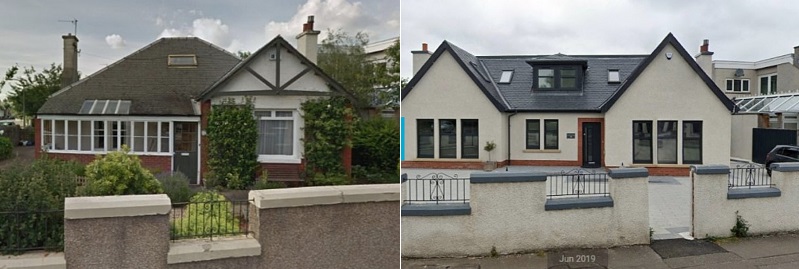
Yes, that’s the same house. The picturesque, somewhat eccentric Victorian cottage has been turned into some neo-Bauhaus nightmare, the shrubbery replaced with… concrete, and the family dwelling has come to resemble the offices of a small architectural firm. To call the change “ugly” is to understate the matter.
I know, I know: it’s a private property issue, so all you librarians can go back to reading Lysander Spooner or Atlas Shrugged. Of course you should be able to do what you want with your property — but as it’s in the public domain (being oh-so visible from the street), I likewise have the right to express my opinion that it looks like shit.
The other bitch about a modern trend has to do with this fascination for the color gray / grey (depending on which side of the Atlantic you live; both are correct). From the linked article, look upon this foul eyesore, and despair:
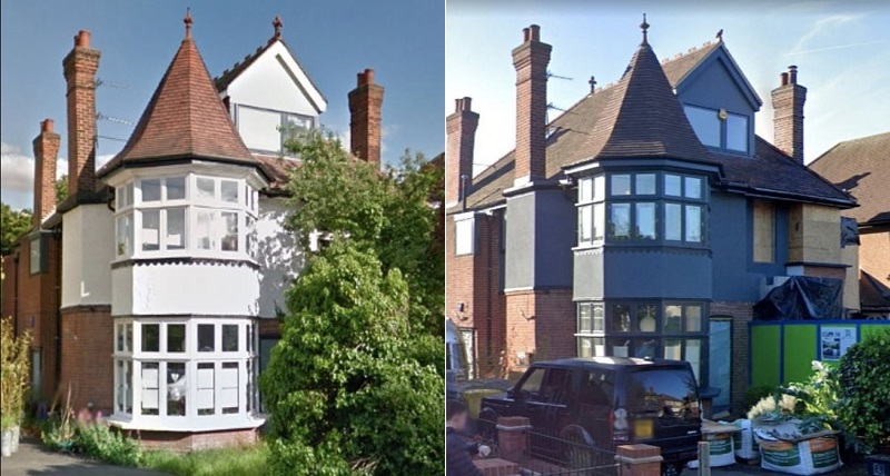
For those who’ve never been to Britishland, allow me to mansplain.
Both these pics were taken on a sunny summer’s day — but, as the old joke goes, that’s not the way to bet when it comes to British Weather. At least 80% of the time, it looks like this:
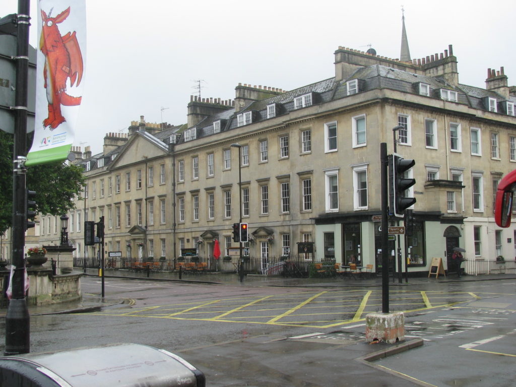
…cold, damp and dreary. In a word: gray.
Now use your imagination and add a gray day to the white house in the pic on the left-hand side, and to the gray house on the right. That’s right: putting a gray house into a gray day turns “dreary” into “gloomy”. Kinda like Edinburgh on any day, come to think of it:
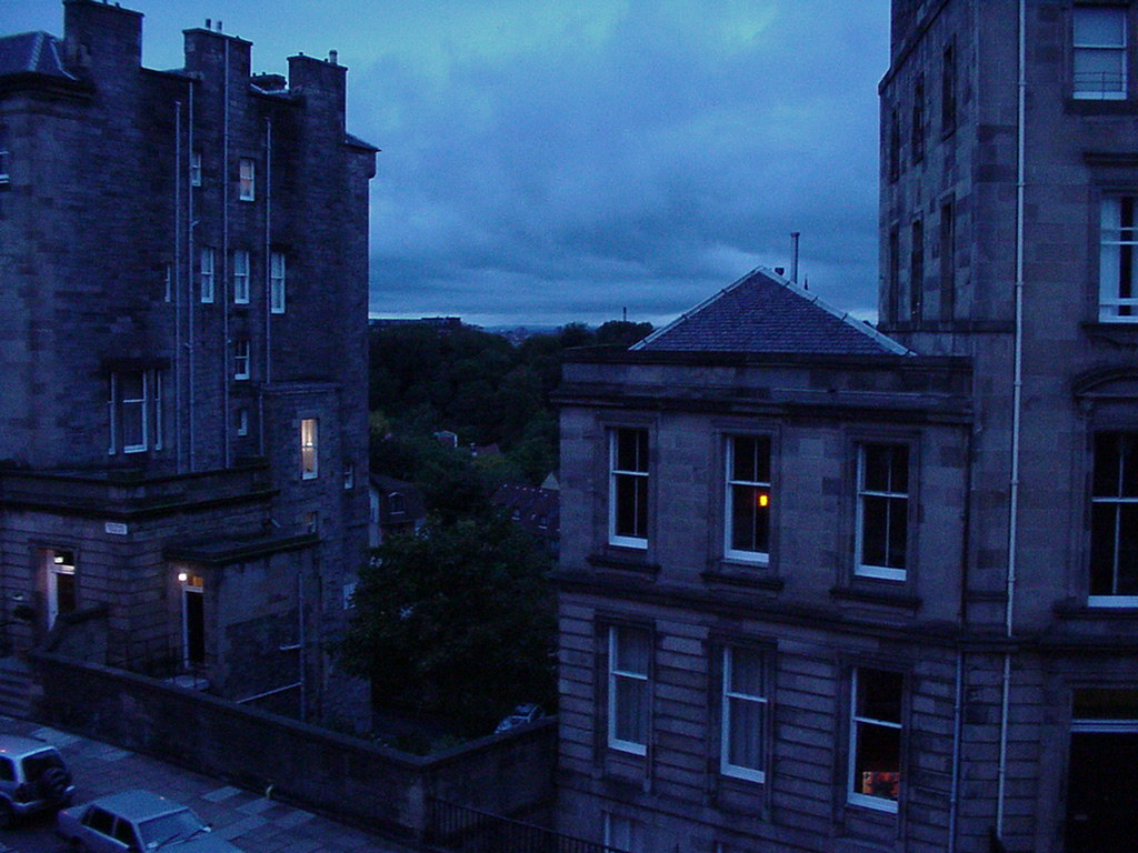
(That was taken from my hotel room just after lunch, in October 1999.)
I don’t really mind gray — light gray — as an interior color, although I think it tends to make the room feel a little cold. In fact, the walls in our current apartment are light gray and while we’d pick a different color (e.g. pale blue or a very light tropical-beach-sand color) if we had our druthers, the gray doesn’t offend. However, the outside of our apartment complex is a dark gray, similar to the gray Victorian above, and that makes me want to bring the dynamite, especially when (like today) it’s overcast, chilly, drizzly and as New Wife calls it, “positively British”. Here’s what I’m talking about (taken at about midday yesterday):
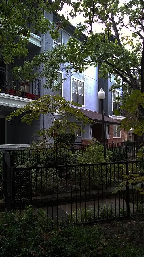
Change that to white walls with gray accents, and we’re talking turkey. As it is… ugh.
Anyway, as I said at the top, maybe the fashion will change and gray will be replaced with some other color.
My luck, it will be avocado green. Then there will be murders.
Gray (grey) must be the most depressing/depressive color for human habitation I can imagine.
A condo in Florida decided to paint the interior corridors an “Agreeable Gray” and add 6000°K 1500+ lumens (125W) every 3′ to a <8' ceiling.
Very bright? Not really! Pretty stupid if you ask me, as well as ugly. Highly depressing: like a prison or a factory.
They're going to probably go to a 3000°K (warm white) light (it might help somewhat) rather than spend the money to re-paint the halls a more pleasant color. Or hire a graffiti artist
I could live with grey. You can at least shift the color temperature with good lighting. If it’s a neutral tone, you can make the room match the time of day with lighting color shifts. You can also do a lot with intense spot colors, which is easy with modern LED color-changing lights.
What I dislike is that no-character light brown that turns up in a lot of houses. Can’t do anything with that. Any color work with lighting usually just turns it into various shades of baby poop.
Here’s the fun part: a lot of those old “white on white” or “white with tasteful trim” houses are, in fact, historically inaccurate.
The Victorian era (at least the end of it) also coincided with the first widespread availability of good enamel paint with saturated colors, and the people who owned big, fancy houses often decided to make full use of that “new technology.”
One neighborhood near where I live had an ironclad rule of “house paint must be historically accurate.” Which meant, to them, “white on white” paint.
One guy didn’t like that, and painted his house dark red with dark blue trim. The local housing commissars went after him… until he showed up at a hearing with a little old lady in tow, and a stack of paintings. It turned out that she had lived there from birth, and had been an amateur painter since she as about ten. She had a pile of paintings of local houses in the colors they were painted when they were new – and it was all of the colors of the rainbow. People only started painting them white when the area went through a “poor” stage, and white paint was cheap.
So the guy basically said, “okay, since you mandate historical accuracy, you’re going to have to make EVERYONE repaint their white houses into ‘historically accurate’ colors like green and red and blue…”
Needless to say, they dropped that policy on the spot.
The Victorian type of house was designed to be painted with two or more contrasting colors to make the styling details of the trim stand out.
Painting them all white wasn’t just because white paint was cheap, painting everything the same color was a lot less labor intensive. If a house painter could paint it all white in three days, It might take him a week or more to do it with multiple colors.
That’s what came after, when the owners of those big pretty houses started getting short on cash.
The whole point of multiple bright colors was “look how much money we have!”
OK …… but the people who actually do have a stack of money preferer houses that you can’t see from the street. Thus high walls – big hedges Long driveways with a “Gatehouse” at the entrance. or just an unmarked street entrance with no sign of what’s down that driveway. The best example I know is the entrance to the Rockefeller compound on MDI in Maine. A simple unmarked single lane gravel driveway. ( with a guard 200 feet down the lane ) leads to a dozen or so homes owned by Martha Stewart and members of the J. D. Rockefeller family.
Black, dark brown, and grey are what a builder has used in my neighborhood.
One, that I call the “Gru” house has its whole second floor black. Who the fk paints a house black in North Dallas?
The other one is modern boxy. Looks like a gas station or firehouse.
It doesn’t say “neighborhood”, it says “compound”
We love to visit old Victorian towns like Eureka Springs Arkansas and look at the “painted ladies”. Some of the color schemes are a little wild – we stayed in a B&B that was orange with pink trim – but that beats white or gray any day.
About 25 years ago we were house hunting and looked at a 70s era home that had burnt orange countertops (and lots of them) and avocado green appliances. The real estate lady called the colors ” funky”. When she asked me what I thought of the place. I replied that I went to high school with a guy named Vito The Torch and he could make some quick improvements to the place.
The gray plague is more accurately know as the HOA plague and it is only one of the symptoms. Back before I escaped, I had the last laugh by finding a color known as “gun metal gray”.
By the way, grey didn’t become the dominant spelling in the Place where Great Britain used to be until the socialists took over.
The area I live in has an HOA (actually a POA, Property Owners Association), and one of the things they do is approve the exterior colors of houses. While that sounds draconian it’s not bad, there are a wide-range of colors (tans/browns, dark reds, dark greens, medium blues etc) and the only ones really excluded are the truly hideous ones (the brighter colors mostly, yellows, bright reds, orange, etc). We live in a place with considerable natural beauty in Northeastern PA, lots of trees, lakes, hills etc. A bright-yellow or swimming-pool blue house sticks out like a cockroach on a wedding cake. There are a few houses here that were obviously painted before the rules were passed, and I figure they may be the reason WHY the rules were passed. I believe some blue colors were recently added to the approved list, because I’ve seen some recently-painted houses that are blue and they really look beautiful.
The Libertarian in me says that you indeed should be able to paint your house any color you like. The practical side of me understands that my neighbors have to actually SEE my house, and would I really want to sit on my deck looking at a house painted to look like a roll of life-savers candies? I’m also reminded that a great many rules exist for a REASON, like the warning not to iron your clothes while you’re wearing them, you just know some asshole did just that and wound up in the emergency room with burns, then sued the iron manufacturer.
When I were a callow youth, my family built a house in a subdivision which had a range of approved paint colors. We didn’t like any of the approved colors, so we chose one we liked which was similar to the approved range, went through the process to get it approved, and proceeded to cover the house with it.
Enter stage left: the neighborhood busybody. You know the type — older lady, walked around the neighborhood all the time wearing a peacoat or somesuch, walking or carrying a pocket dog the size of a New York sewer rat. She evidently didn’t like the color, and complained to the HOA (vile demon-spawn organizations, those). 1 complaint.
Guess who had to repaint their not-yet-moved-into house? And the new paint job must have been done by Slappe-Dash Painters, LLC.; drips and thin spots were visible in many spots.
Chacun à son goût, but I still think Banksy would be a help to a faceless, gray wall
Even the Norks realized that Pyongyang was just a little TOO gray, and they painted their row upon row of peopleboxes multiple colors.
Eight years in Britishland proved to me that absolutely no one does gray & dismal as well as the Brits. Flip side is, when it’s actually pleasant there it is stunningly gorgeous.
I kind of agree with you, Kim, to a point.
First, there’s that “Free American citizens are allowed to have different tastes than you and I” thing. Of course, that is why HOA’s came into being, isn’t it.
I bought a house 20 years ago that was built in 1979. Trust me, it looked every bit like a child of the seventies. Over the years since, I have upgraded as I could afford it. (Anyone need an old-style commode? I have one in the back shed you can have for free. It works fine, but is a nice avocado color.) We recently did a kitchen remodel and replaced the old-style cabinets and the yellow Formica counter tops and backsplashes. (We found an old pop-tab under the cabinets when we did the demolition. How long has it been since you’ve seen one of those?) The next big project is to either replace or paint the fine quality, but very dark, wood paneling in the family room. As to the exterior. Well, it’s the same color as most of the houses around these parts – a very dull red color – the same color as most brick. We have redone all the exterior trim from a dark green to a much nicer white.
But enough about my money pit. I think you will find that a lot of the reason for dull drab colors like grey are for one reason – resale. A house that is a bright color, like yellow for example, will attract a certain type of buyer, but will be rejected by a similar number – or more – of others. Grey? Well, that’s a nice neutral color that will tend to attract more buyers – or so goes the theory.
Some very close friends of mine owned a three story house that was built in 1898. It had a lot of amenities such as a large wrap-around porch and even a turret. It was painted a bright white color, but the cladding and paint finish was well worn and needed to be redone. My friends, instead of redoing all of that – a very expensive proposition – instead had it covered in vinyl siding. It was a very light grey with dark grey accents. It actually looked very nice. (Of course, we don’t live in British-land. We live where the sun actually shines most of the year.) A year or so later, my friend got transferred to Tulsa OK and had to sell that house. They got their asking price within a few days of it being on the market. That was in 1998. I have driven by there frequently over the years and that siding is still there and it still looks good.
They don’t call Aberdeen “The Granite City” for nothing. It’s granite or brick. Maybe a few accents of pink granite.
The three bedroom ranch built in the 50s that I grew up in from the 70s through 80s had the avocado breen stove and fridge. They lasted ages. We also had avocado green linoleum in the kitchen and red countertops. Oh and the wall paper was some sort of flowery hideousness. My mother remodeled in the early 90s with a cream or tan colored seamless linoleum, tan stove and tan fridge. I forget what the countertops were changed to. Originally the house with partial brick exterior was a chocolate brown color. In the early 90s I helped paint it a light gray. It looked brighter than the dark chocolate brown. The house was eventually demolished in the early 2000.
My father’s house which had been in the family since the 1880s or so was also demolished around the same time. The outside was painted dark green. That house too was demolished in the 2010s.
JQ
Harvest Gold?
I spent my misguided youth as a cadet at West Point. The winter months there are referred to as the “Gloom Period.” Gray stone buildings, gray skies, gray mountains covered with leafless gray trees, the frozen, gray Hudson River and gray-faced cadets wearing gray uniforms trudging to class through the gray snow. All at an average temperature of about 20 degrees. Fecking dismal.
My brother is an architect who would just love the blocky white on white buildings, particularly if they had flat roofs. He said once that the men’s restroom at his architectural school was all black except for the porcelain fixtures. It had very bright light, but the black tile soaked up all the light so it was gloomy. He decided it was that way as an object lesson to the students of what colors to NOT use.
“Harvest Yellow”